
The Clinical Trial Feasibility Tool is designed to streamline the way internal stakeholders assess and compare clinical trial scenarios. Built for a leading pharmaceutical company, this tool reduces cognitive overload by transforming raw data into intuitive visualizations, empowering faster and more strategic planning decisions. By aligning with the growing demand for data-driven trial operations, the tool positions the client at the forefront of innovation in clinical research strategy.
My Role
UI Design, Prototyping, Design system implementation
UI Design, Prototyping, Design system implementation
Challenge
Clinical Trial Feasibility Tool
Clinical Trial Feasibility Tool
︎Impact
✅ Translated complex feasibility data into a digestible visual format
✅ Reduced time spent comparing trial scenarios manually
✅ Created intuitive workflows that support real-time planning decisions
✅ Delivered high-fidelity mockups with scalable, component-based UI
✅ Tool is now in active development, with Phase 2 set to introduce smart recommendations and deeper automation
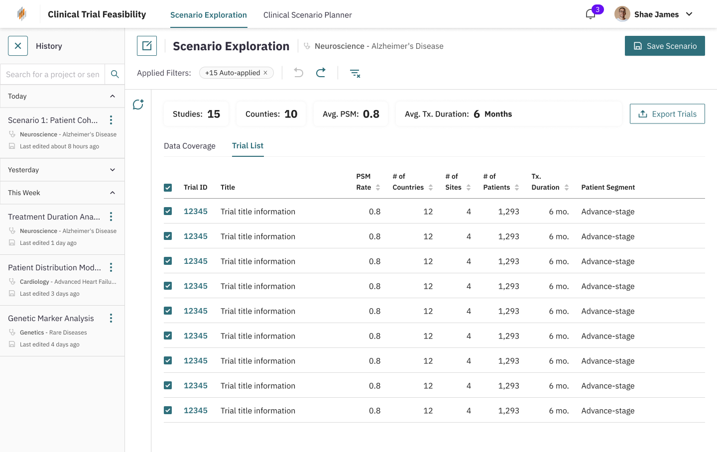
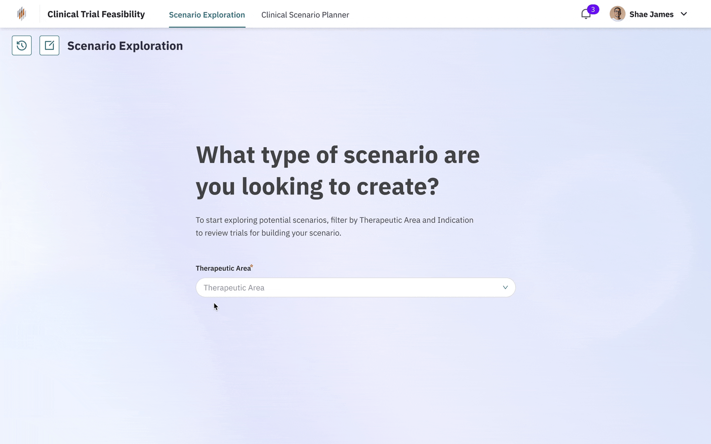 A user flow showing how clinical planners filter by therapeutic area, select trial scenarios, and seamlessly transition into the comparison view, turning raw data into actionable insights within seconds.
🧠 The Challenge: Too Much Data, Not Enough Clarity
︎Context
I joined this 1–2 month sprint as the UI Designer, working with a Senior UX Designer, Data Science Manager, and clinical consultants.
Our goal: build a feasibility planning tool that helps internal teams quickly explore and compare potential trial scenarios. The initial concepts were grounded in user conversations led by our strategy and UX teams, providing a strong foundation for design. I used Figma and an internal design system to quickly translate these insights into a functional, intuitive UI that aligned with real planning workflows.
︎Challenge
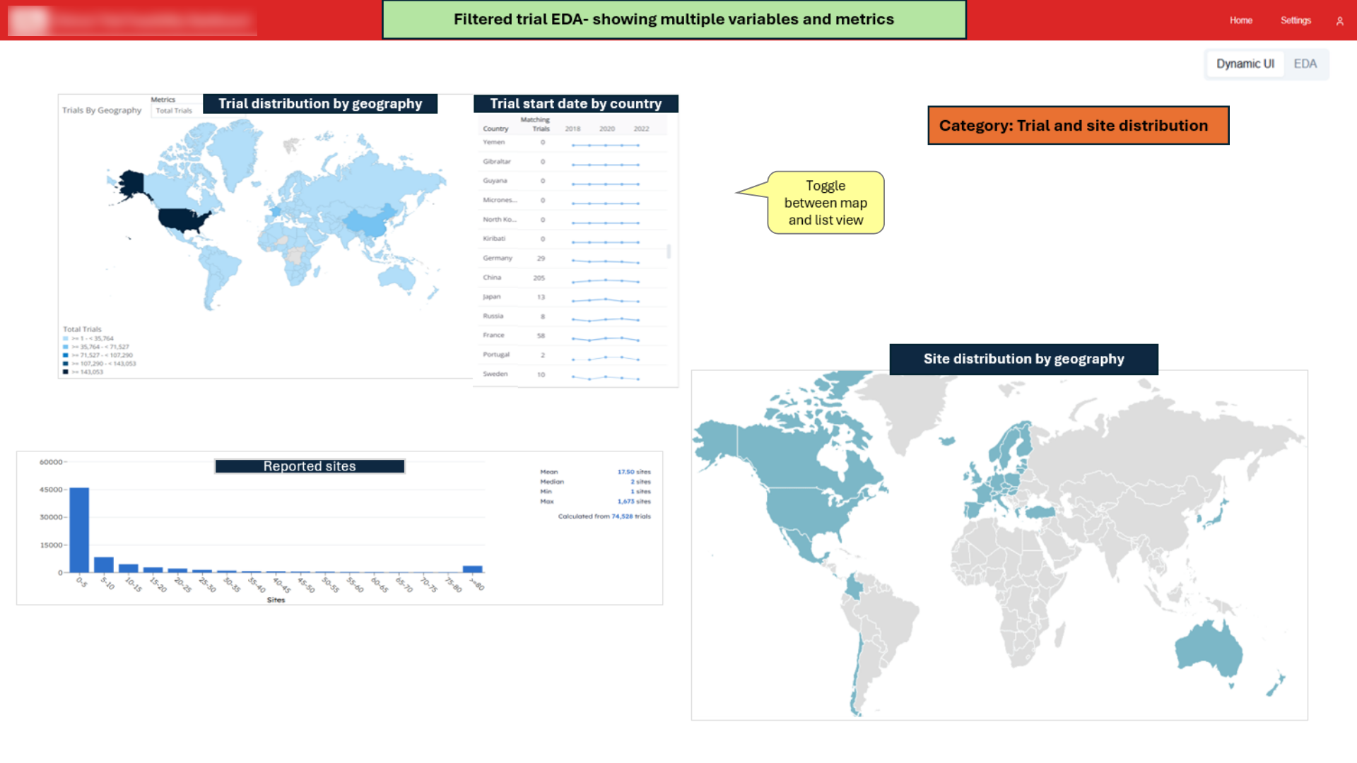
Clinical planning teams were overwhelmed. They had detailed feasibility data for dozens of potential trial scenarios, but it was all buried in dense spreadsheets and static dashboards. Cross-comparing scenarios was slow, manual, and mentally taxing.
The real challenge? Cutting through the noise. These teams needed a better way to explore, compare, and make strategic decisions, without spending hours decoding raw data.
🔎 The Strategy: Split the Journey, Simplify the Story
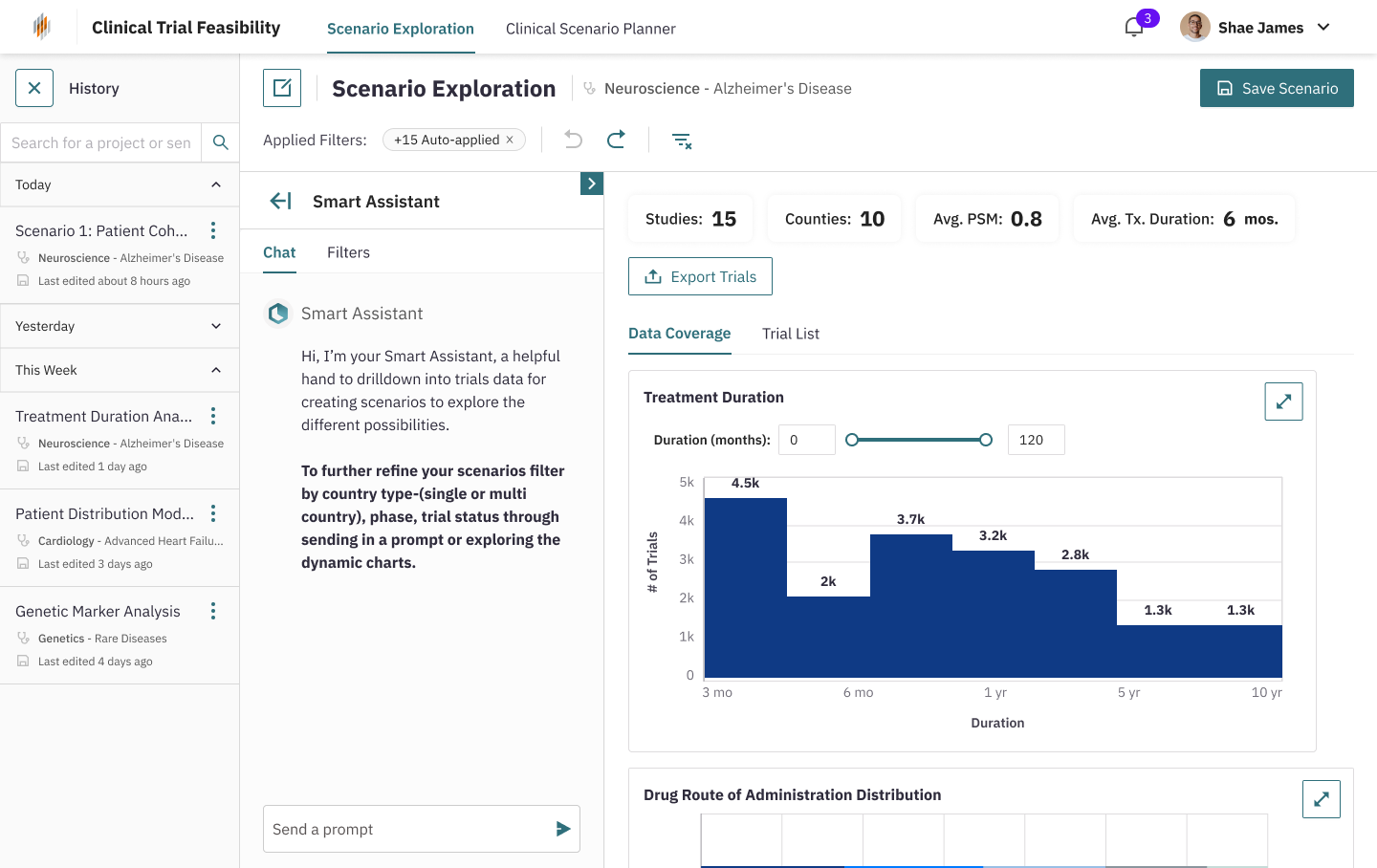
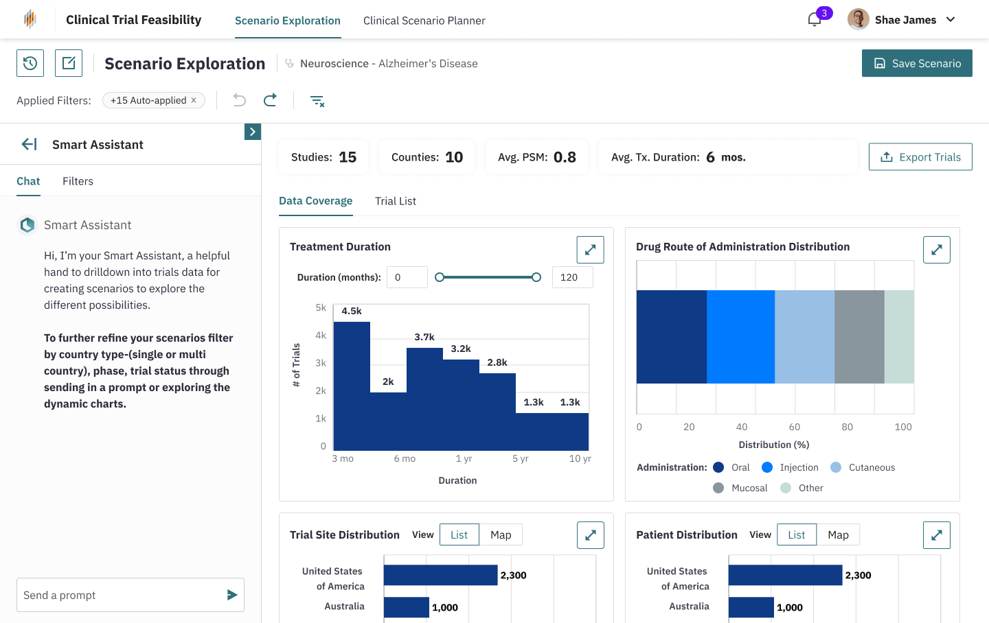
We broke down the workflow into two clear modes:
Scenario Exploration: A bird’s-eye view to help users understand trends across trials
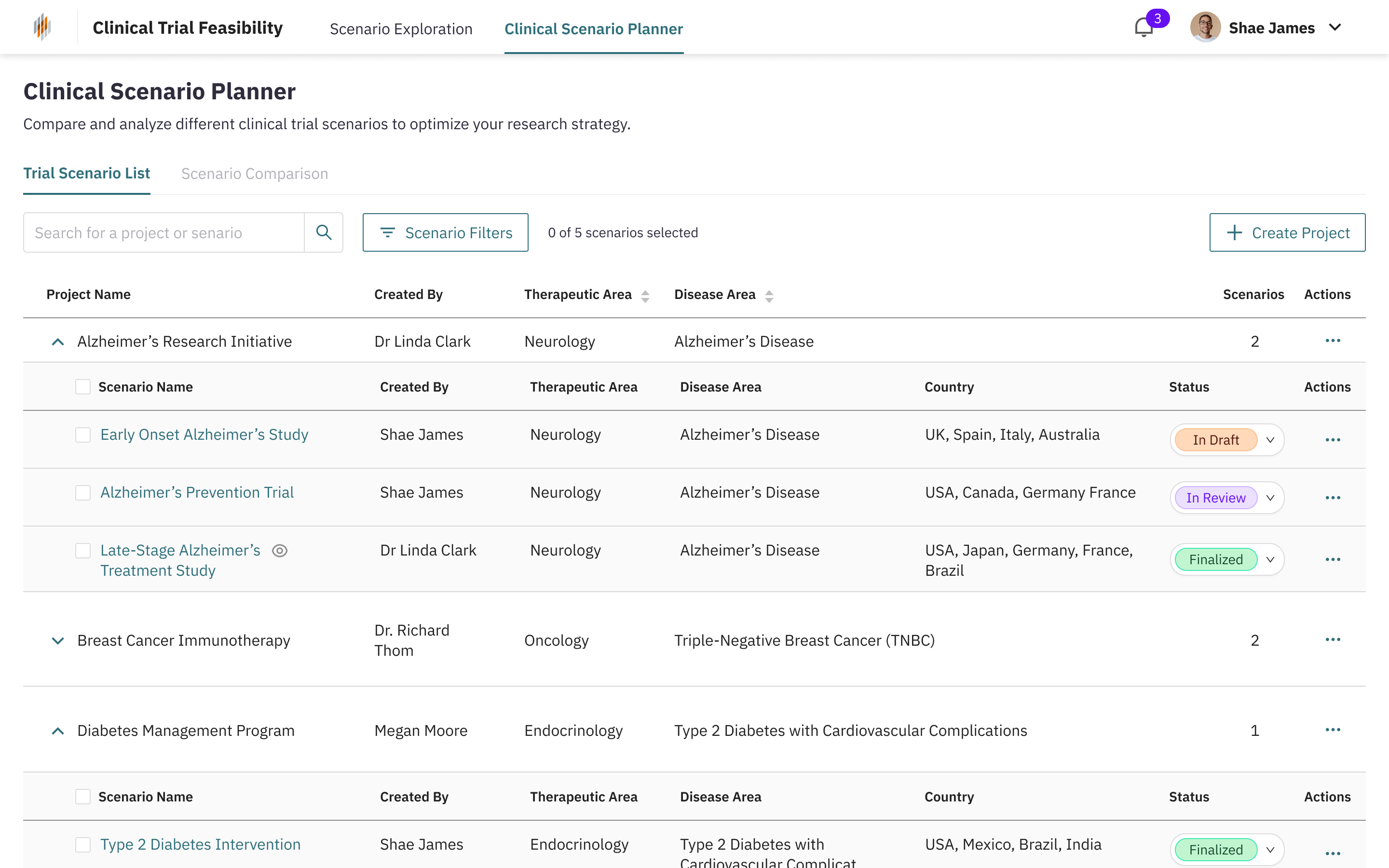
Scenario Planning: A focused view to compare selected trials in a structured, side-by-side format
Scenario Exploration: A bird’s-eye view to help users understand trends across trials
Scenario Planning: A focused view to compare selected trials in a structured, side-by-side format
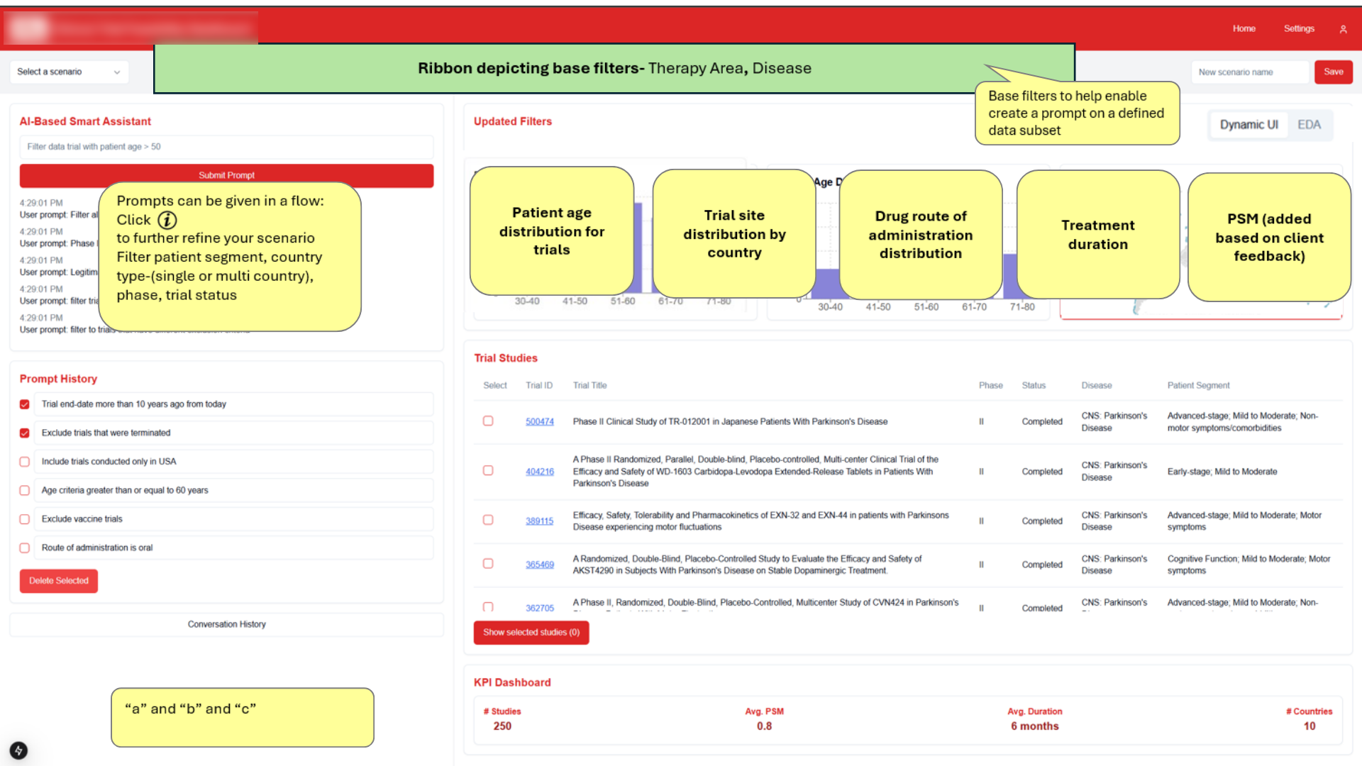
The UI was kept intentionally minimal, clear typography, strong hierarchy, and visualized metrics helped reduce mental load. Tooltips, collapsible filters, and a smart assistant sidebar helped guide the experience without overwhelming it.
🛠️ Building the Vision: From Sketches to Screens
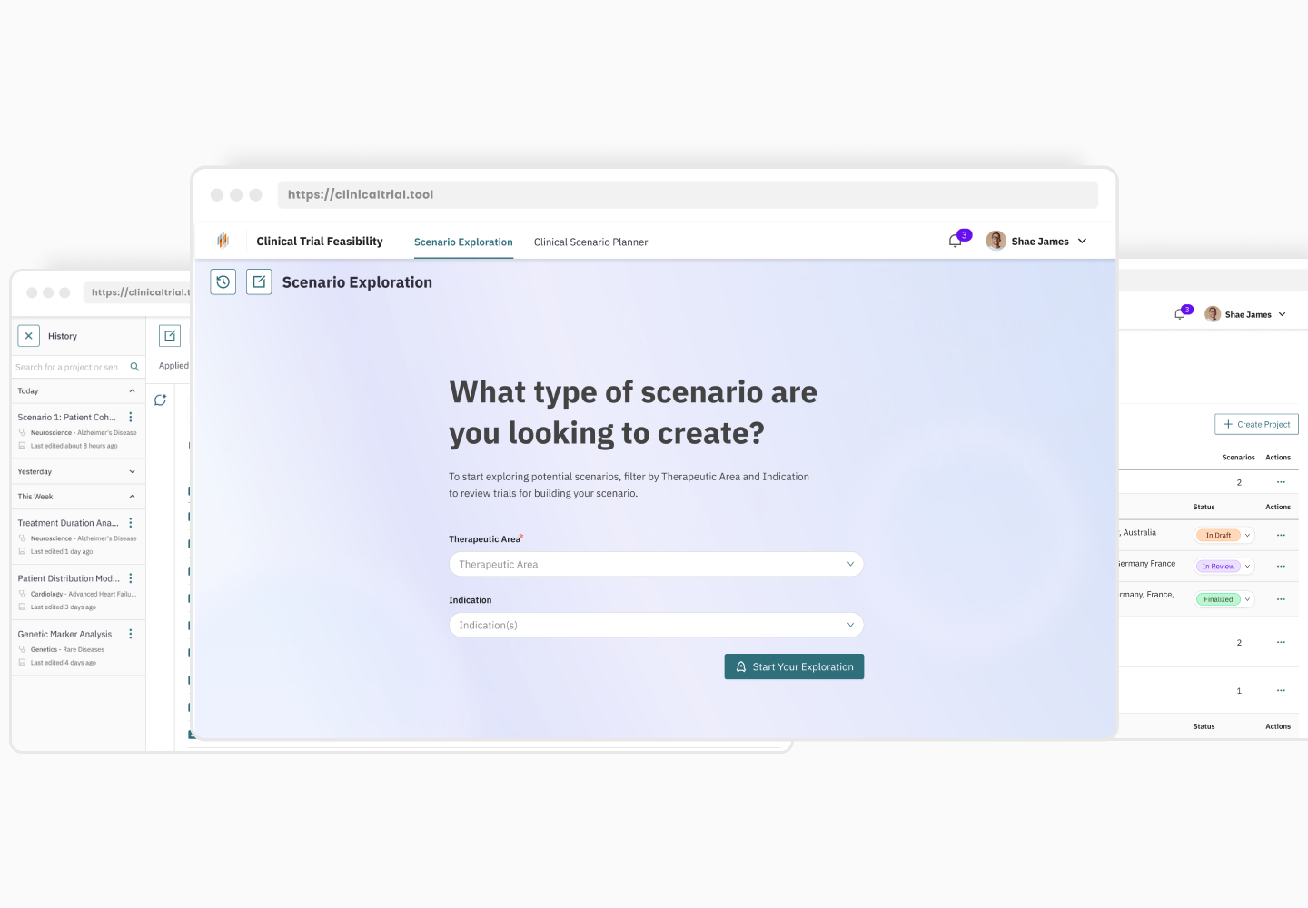
We started with wireframes that mapped out different flows:
Filters > Scenario Preview > Detailed comparison.
These early concepts were influenced by user feedback captured by the strategy and UX team.
Filters > Scenario Preview > Detailed comparison.
These early concepts were influenced by user feedback captured by the strategy and UX team.
Early layout showing progressive exploration, users begin with filters, view summaries, and build toward comparison
We explored several layout directions, cards vs. tables, accordion views, and tabbed drill-downs. The decision to go with a persistent side panel and unified table view came from stakeholder feedback that emphasized reducing interaction effort and maintaining context.
Alternate concept with stacked views, eventually simplified to a single-screen experience based on feedback around reducing toggling and improving scanability.
Once the structure was nailed down, I focused on micro-interactions and visual polish:
-
Added summary rows with plain-language insights
-
Used progressive disclosure to manage dense info
- Applied consistent spacing and data grouping to ease comparison

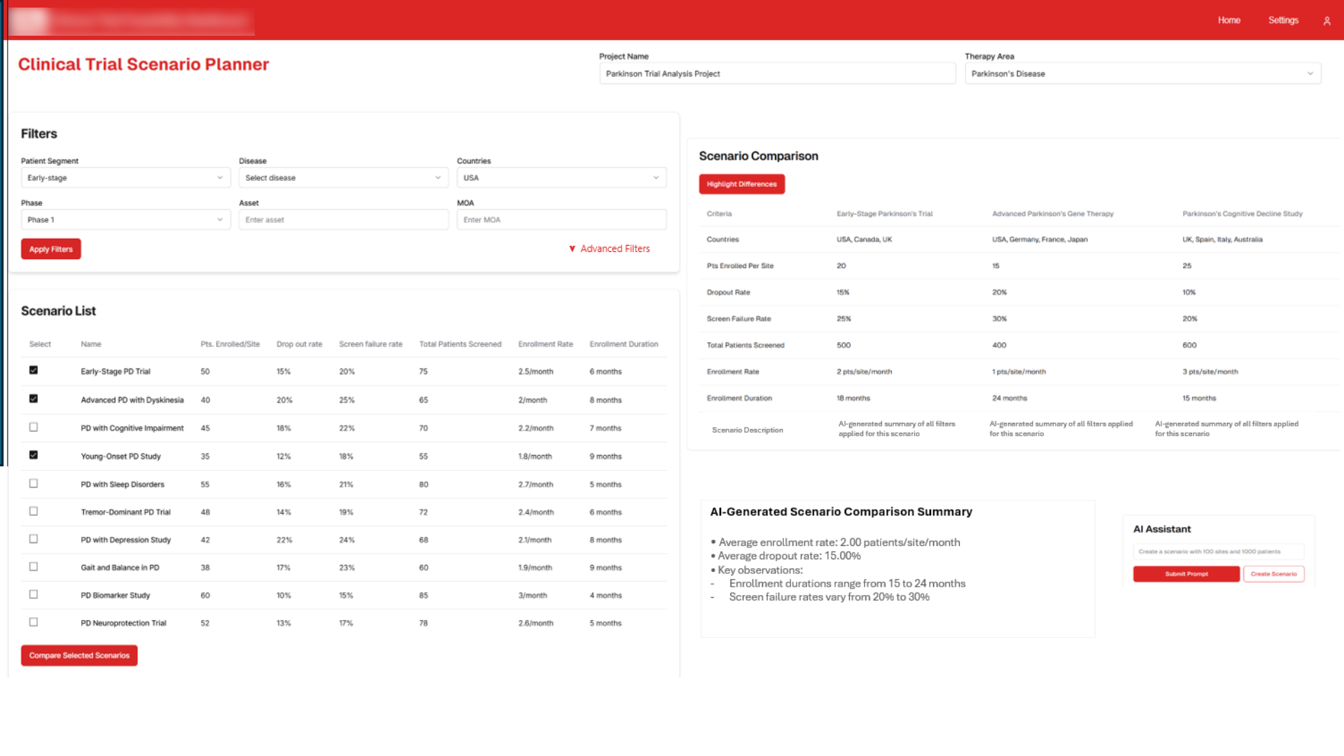
Final table design lets users compare 3–5 trial scenarios across critical metrics. A smart summary below the table highlights the biggest differences.
🚀 The Result: Strategy in a Single Glance
The final interface empowers trial planners to move quickly from exploration to decision. Instead of juggling static reports and spreadsheets, they now see clear summaries, intuitive filters, and visual comparisons, all in one flow.
💬️ Feedback from stakeholders has been positive:
By distilling complex data into digestible narratives, this tool helps users spend less time decoding and more time deciding.
💬️ Feedback from stakeholders has been positive:
“The layout just makes sense. I can finally see what matters and make a call without digging.”
By distilling complex data into digestible narratives, this tool helps users spend less time decoding and more time deciding.


🔮️ What’s Next: Smarter, Deeper, Faster
The tool is currently being developed and tested internally, with Phase 2 on the horizon, focused primarily on engineering enhancements and backend optimization. This next phase is aimed at refining performance, deepening data integrations, and expanding the tool’s overall functionality.
While the core design foundation remains intact, I’m excited to see how engineering efforts in Phase 2 will elevate the tool’s power and precision.n.
While the core design foundation remains intact, I’m excited to see how engineering efforts in Phase 2 will elevate the tool’s power and precision.n.
⚠️️ Due to confidentiality agreements and privacy obligations, the client’s name and branding cannot be disclosed. All visual content has been revised with placeholder data and generic branding for the purpose of showcasing design work. The structure and interaction model of the tool remain representative of the final delivered solution.