Project Neutral had been contracted by the City of Toronto to develop an online tool that could help in the planning of community climate projects, we proposed the development of a website called Low Carbon Communities︎.
My Role
Product design
UX Research
Design workshop, Usability testing
UX/UI design
Product design
UX Research
Design workshop, Usability testing
UX/UI design
Results
Built the product from zero
Designed a Web & Mobile application
Simplified flow
Built the product from zero
Designed a Web & Mobile application
Simplified flow
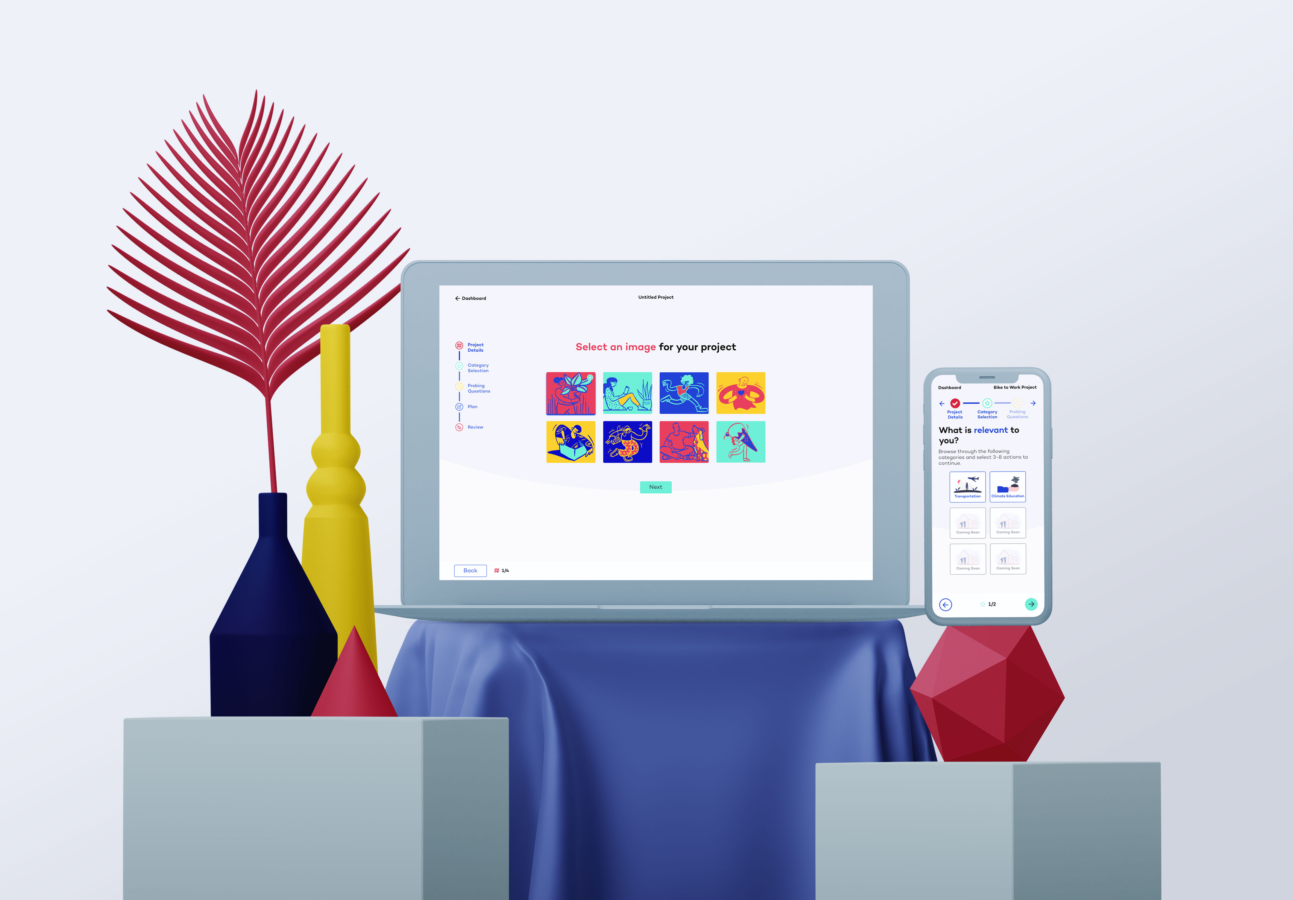
Project Overview
This was a complex project and one which required a long discovery phase, several design iterations and user testing to arrive at a product that would help with project planning and estimating carbon emission reductions.
Client Needs
Project Neutral is a small charity with a limited budget. They needed a well-rounded UX Designer who could:
• Scope this project and do UX research to find inspirations to refine the project parameters
• Design multiple wireframes for review by Project Neutral staff
• Conduct UX review and feedback sessions with our clients
• Design a high-fidelity mockup within our design guidelines and our frontend framework
Our path to discovery
When I was introduced to the project, we immediately realized that Discovery is the preliminary phase in the UX design process that we must invest in, in order to begin designing this product.
We understood that we must collect detailed information about the business, digital product, its users and explore every aspect of the project to identify and frame the problems and opportunities to decide on possible solutions.
︎Investing in the UX discovery helped us to:
Mitigate scope creepBetter identification of project landscape and goals results in more accurate estimates and less frequent extensions to project duration that may delay the ultimate release.
Avoid additional expensesClear goals and requirements allow to sustain the general project direction and cut off costly changes in the subsequent development stages.
Set realistic timelinesThe primary research enables the development team to plan the scope of works based on complete information, hence, set precise project boundaries.
Resolve confusionInvolving all key stakeholders and units at an early stage of cooperation leads to a better synergy and mutual understanding of the problem and the best ways to tackle it.
Enable simultaneous development of different product componentsUnlike when starting the project from the design stage, the information gathered during UX discovery allowed us to speed up the overall development pace and make fewer edits in the future.
Customer journey mapping: need, interactions, emotions
I wanted to understand the user through their goals and needs. This also included project discussions with the client and stakeholders to understand their product and general vision. Following these sessions, I created a customer journey map to visually illustrate the customer’s needs, the series of interactions that are necessary to fulfill those needs, and the resulting emotional states a customer experiences throughout the process.
Need: what a customer has set out to achieve
Interactions: the necessary steps for a customer to satisfy those needs and achieve the overall goal
Emotions: the customer’s emotional state, including needs met, goals accomplished, and satisfaction level; before, during, and after the experience
Need: what a customer has set out to achieve
Interactions: the necessary steps for a customer to satisfy those needs and achieve the overall goal
Emotions: the customer’s emotional state, including needs met, goals accomplished, and satisfaction level; before, during, and after the experience
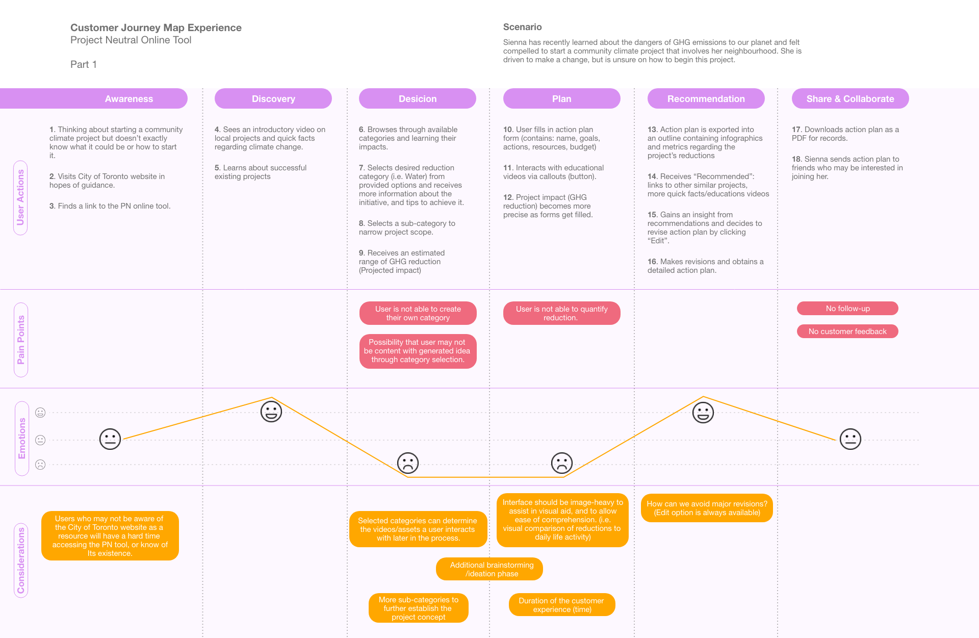
Customer Journey Map: Part 1 (users new to project planning)
Customer journey map: Summary of insights
The customer journey maps illustrated 2 main possible users: Part 1 & 2; users new to project planning vs users that have a clear idea and goal. It entails their interaction and experience with the proposed online tool.
The following are the insights and areas of improvements I’ve discovered:
Part 1: User who wants to coordinate a community project but is unsure on how to start it.
Insights
• The ‘Decision’ and ‘Plan’ stages are areas of improvements as the touchpoints in these parts cause a negative emotional status for the user. This is particularly due to the lack of customization or options in order to increase inspiration and motivation. They may feel restricted based on the system’s user pathways.
• User is not able to quantify the GHG(greenhouse gases) reduction.
• Visual and graphic elements, along with the appropriate UI design should be used as visual aid to allow ease of comprehension, and to encourage the user throughout the experience.
• A follow-up or customer feedback is nonexistent. Therefore, this may decrease the overall quality of the experience as this disallows further guidance, especially for users who may be new to project planning.
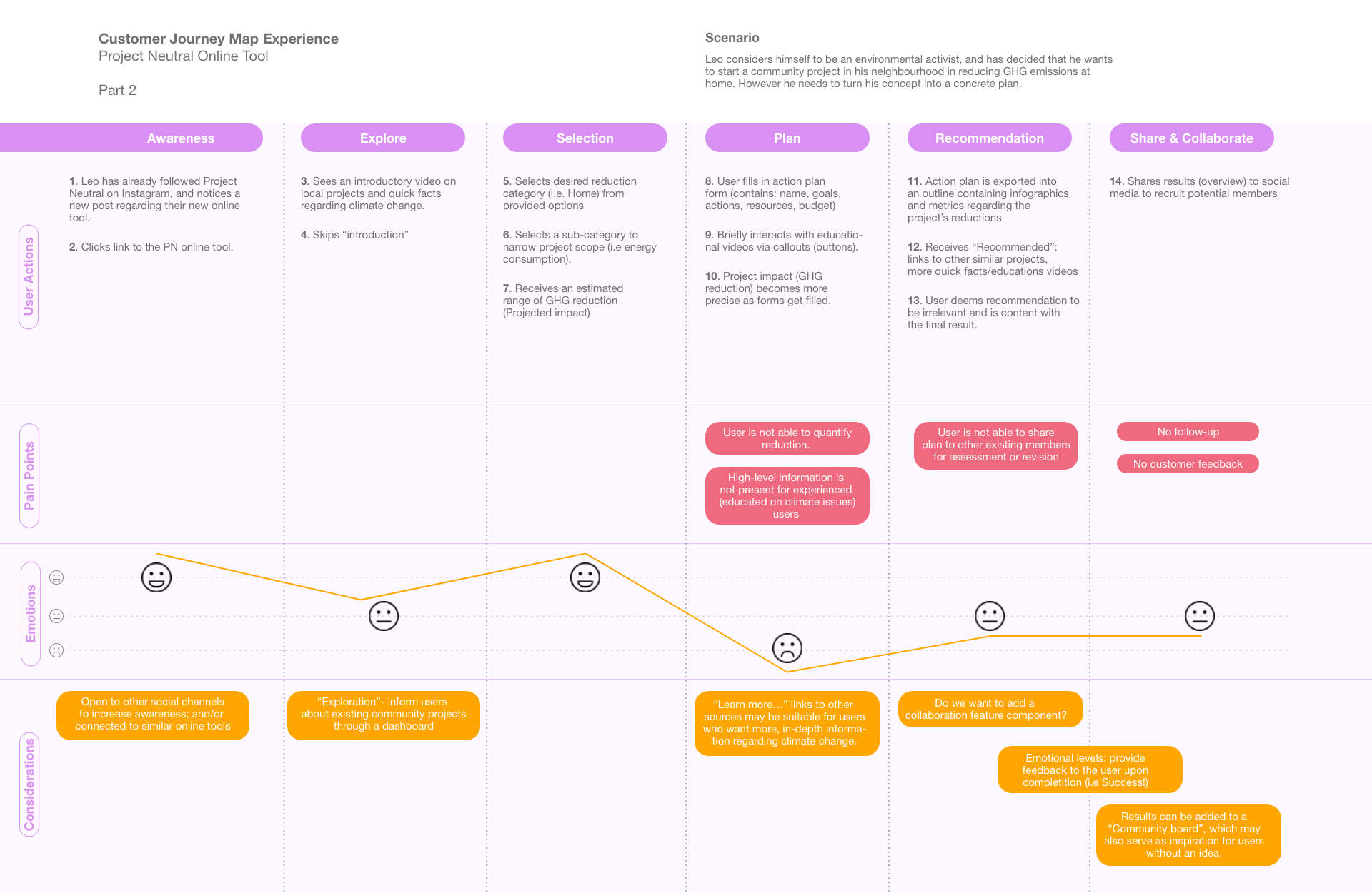
Customer Journey Map: Part 2 (users that have a clear idea and goal)
Part 2: User who has an idea, and wants to turn it into a concrete plan
Insights
• The ‘Plan’ stage is an area of improvement because the experienced user does not have access to in-depth information regarding climate change. Though the information provided may be suitable for new users, this may hold little to no value for experienced users who has a specific idea.
• An element of collaboration can assist the user in sharing their project plan to other existing users.
• The user’s emotional state should be considered in every step of the journey.
• Allowing created projects to be shared in a ‘community’ can aid other users for inspiration.
Capturing ideas and making decisions
I found user flows a great tool during our discovery phase because it was the fastest way to visualize the imagined process; which I can easily share with the team as well. It allowed us to get a bird's-eye view of the product from start to finish and find any potential gaps or opportunities.

Early user flow
Design Workshop Session: Card Sorting
When thinking about what this online tool will provide our users to aid their goals in project planning and estimating carbon emission reductions, we wanted to gain knowledge about the information required that makes a great project plan. Therefore, we conducted an online design workshop with our stakeholders and tasked them with a card sorting activity in Miro.
We decided to use the card sorting technique because we wanted to discover how people understand and categorize information. This also gave us the opportunity to learn about any elements within a project plan that should be included and how to visually portray such information. We envisioned our online tool to provide users something that is action driven.
Design Workshop Setup
1. Users are given a set of project planning elements — Each card is labelled and represents a particular element that you may see on a project plan regarding climate change action (i.e. long/short term goals, GHG reduction, budget, etc.). We also give the user the ability to create a new card, if they wish to include an element that is not provided from the given set.
2. User organizes their selected cards based on expectations (importance and value) — We instruct the users to arrange the cards onto the empty rectangle (represents the project plan document).
3. Debrief the user — We ask users to explain the rationale behind the grouping they created. This step encourages conversation to allow them to hear from other participants as well.
4. Analyze the data — Once all the data has been collected, the team and I look for common groupings, themes, and items that were frequently paired together. This allowed us to design our wireframes and mockups.
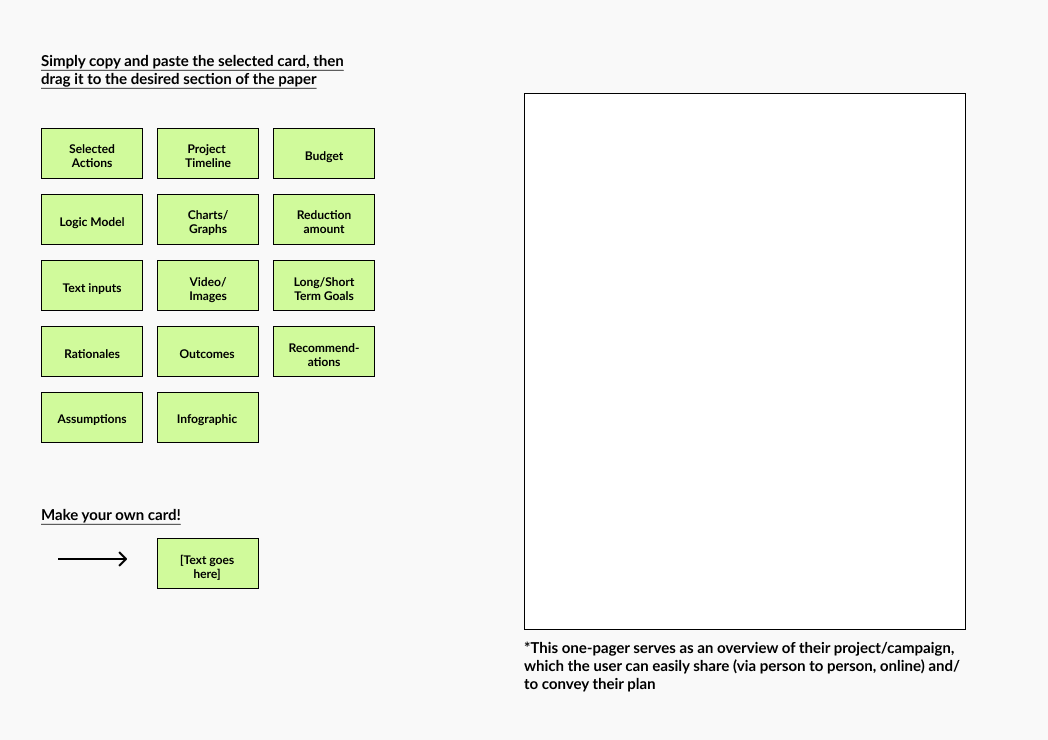

Card sorting setup (left); Some of the card sorting results (right)





Wireframes (Web)
Ca
Designing the key stages of
Low Carbon Communities
︎1. Project Details
The user inputs the main problem they are trying to solve and the ultimate goal of the project.
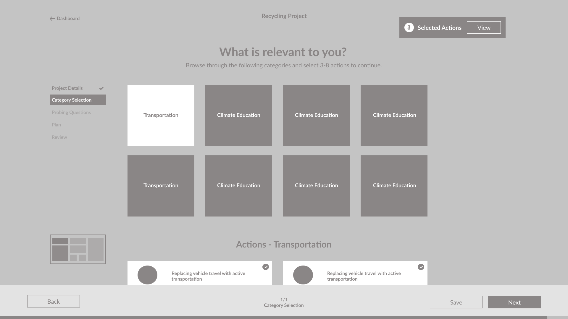
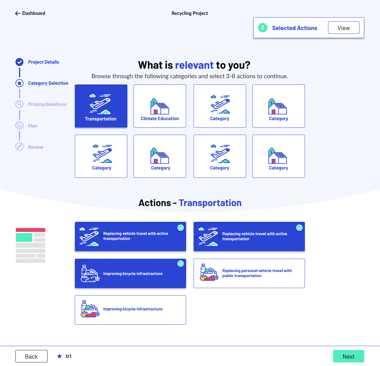
︎2. Category Selection
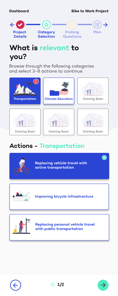
Allows the user to find an area of interest. Then, they are presented with a sub category selection; “Actions”, which is related to their selected initial category. These “Actions” are eco-friendly initiatives that comprises the final outputted project plan.
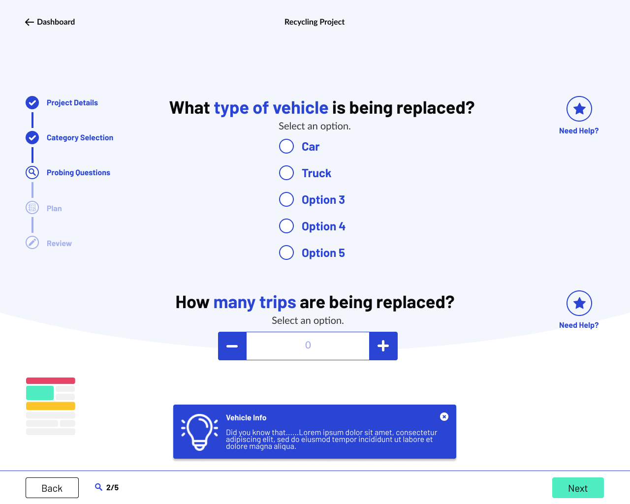
︎3. Probing Questions
This stage is the generated survey based on your selected “Actions” from the previous stage. It gives us the estimated GHG reduction of your project.
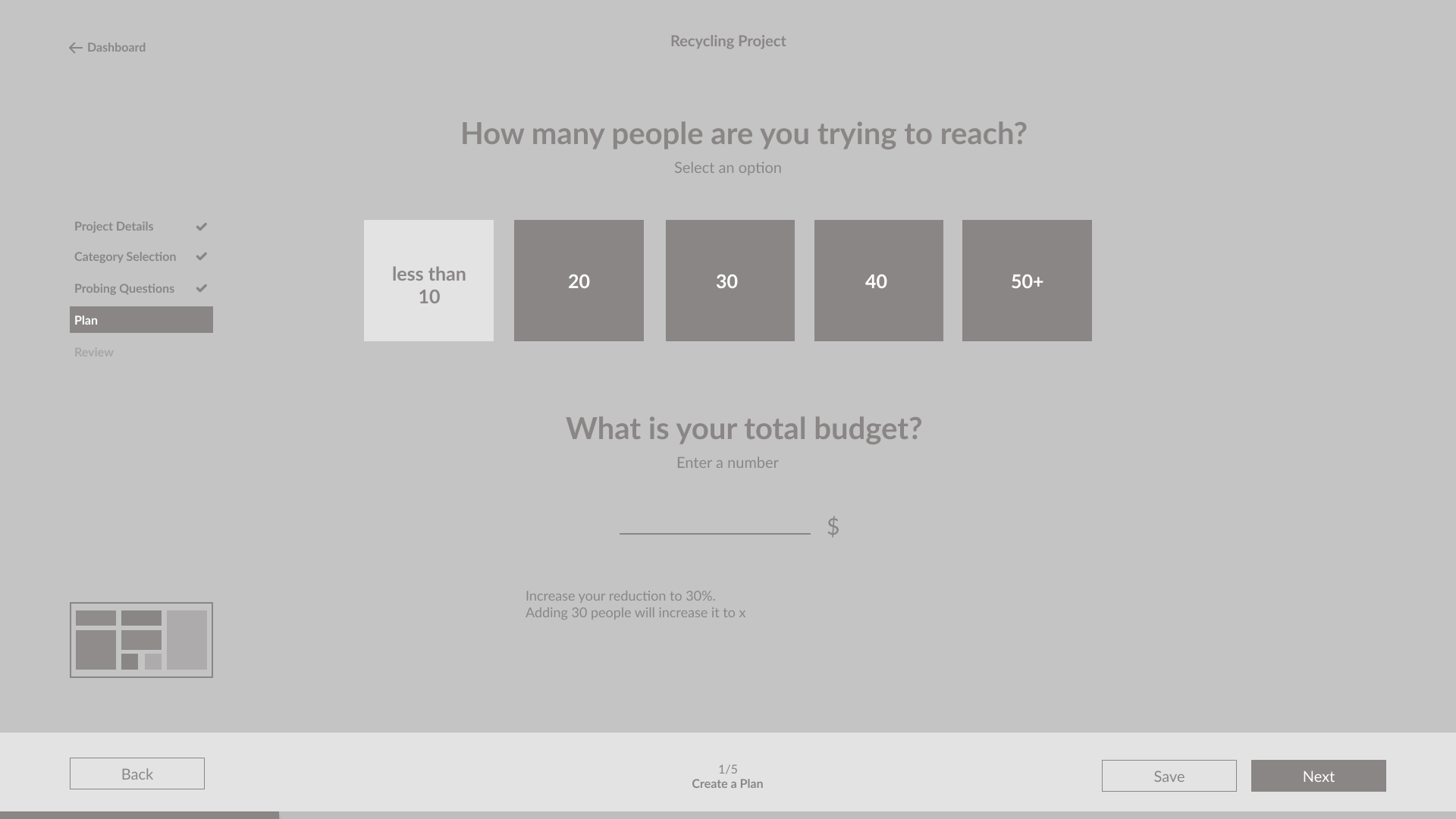
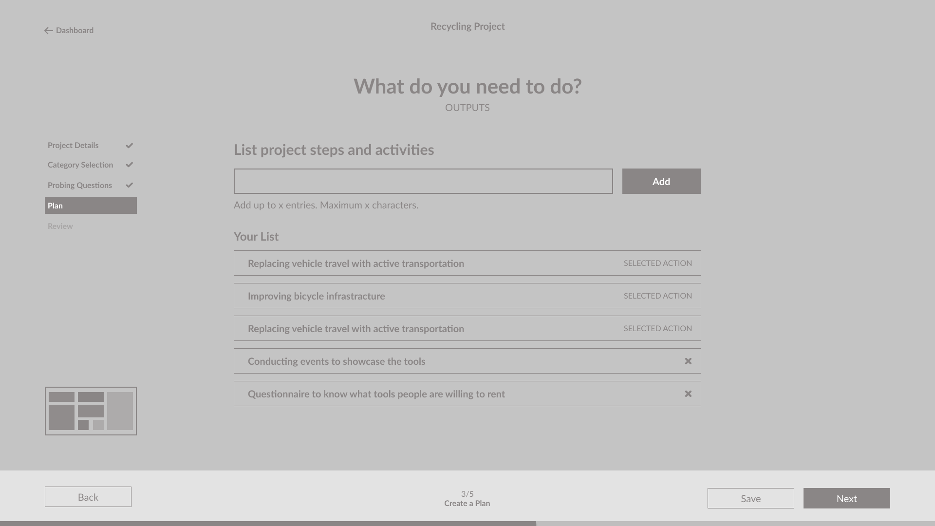
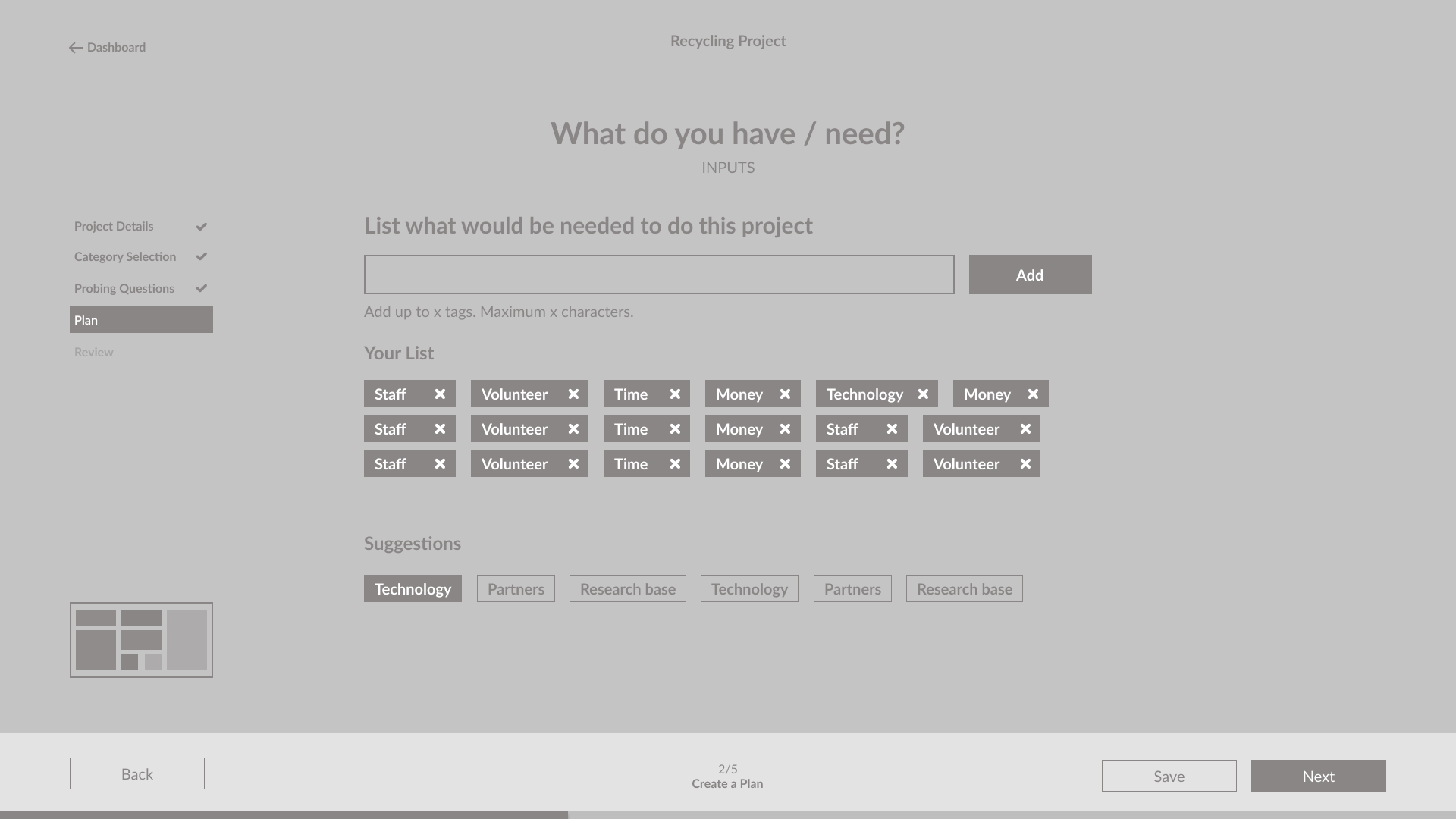
︎4. Create a Plan
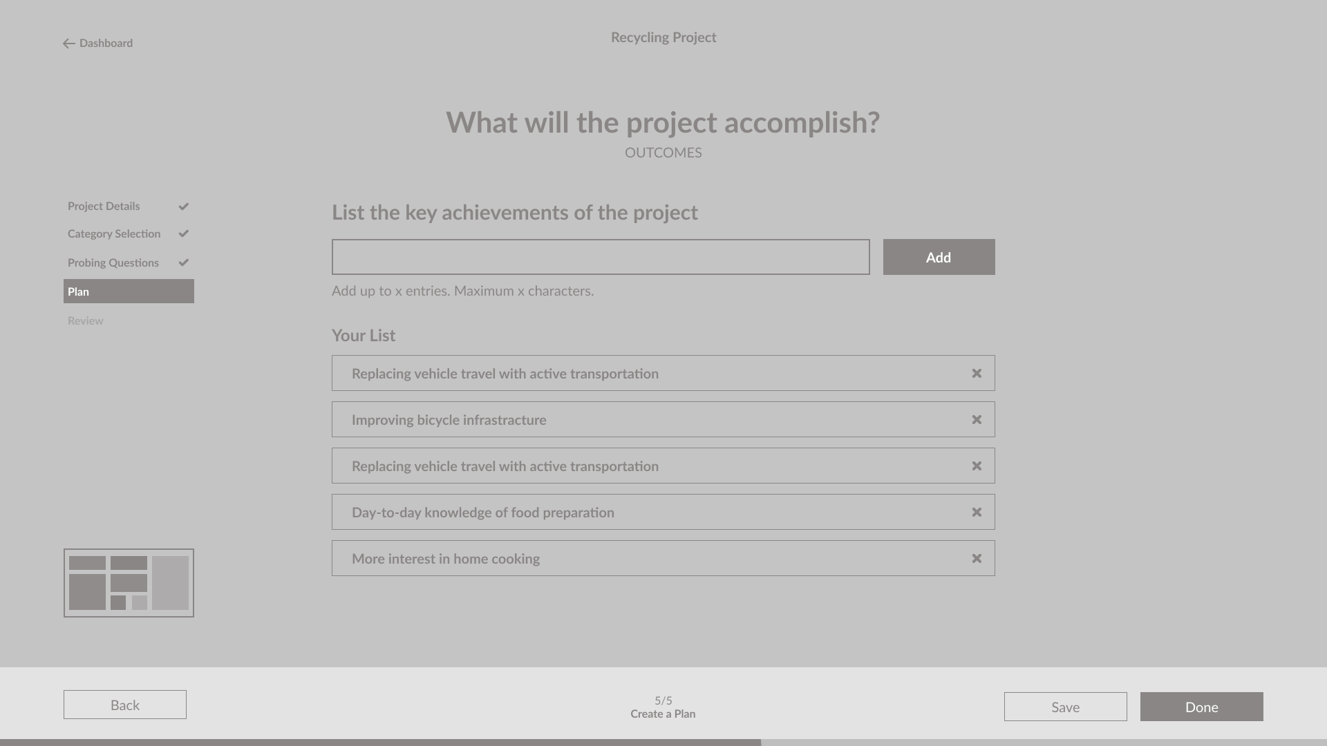
Prompts the user to think about the steps they need to do in order to start their community project. Alongside, the budget, outreach, etc.
︎5. Review
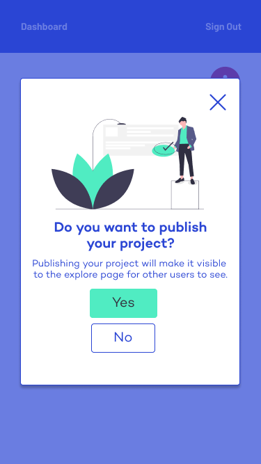
This is the final stage of the online tool, where the system presents you with your final project plan. You can decide to download, share, or publish your work.

Improved User Flow



Early version of high-fidelity web mockups
Guerrilla User Testing: Outcomes and Design Solutions
After a few design iterations and countless rounds of client feedback, I conducted a guerrilla usability testing session, as it was a quick, cheap and hassle-free way of gathering feedback from our potential users, while considering the current project scope and our limitations. This method gave us a sense of the user interactions and their perceptions towards the existing web/mobile design.
Summary of outcomes
• All users appeared to have a positive experience for majority of the testing with minor errors.
• Navigation (menus) was intuitive and enabled the user to identify their position within the process.
• The visual and graphic elements are organized and easy to understand, where it made the user inclined to engage with the interface.
• Insights mainly came from a few challenges that have put the user on a discourse throughout their journey. This consists of UI elements (See main user challenges) that have to be adjusted or redesigned to further promote a seamless experience.
The user testing provided us a first-hand human insight of understanding our customers, by listening and observing with empathy. It enabled us to connect the dots between what people think, feel, and do. Our insights from the users’ challenges helped us transform errors into solutions.
The general emotions and excerpts regarding the product’s look and feel:
“friendly”, “i didn’t feel pressured or stressed”, ”fits branding of Project Neutral”, “doesn’t feel judgy”, “clean”, “easy to navigate”, ”easy and accessible”, “user-friendly”, ”design is beautiful”, ”laid back”, ”minimal”
Main User Challenges
︎“Need help?” button (Web)
All users were unsure about the “Need help” button (Fig. 1.) because the phrasing appears to insinuate assistance with the platform, and not the question itself, which it was intended for.
︎ Possible design solutions:
• Rephrased to connect it to the question (“Did you know?”, “Learn more”).

Fig. 1. Need Help? button
︎Lack of
visibility:
“Selected Actions”
(Web/ Mobile)
80% of users were unable to recognize the “Selected Actions” (Fig. 2.) function when asked to find where their selected actions were stored. This is because this functionality lacked visibility, which made it easy for users to ignore or pay it little to no attention.
︎ Possible design solutions:
• “Selected Actions” needs to be more visible. This can be achieved through the use of contrast, colour, and animations.
• An overview of their selected actions with the same editing capabilities can be accessed after hitting the forward arrow/next instead of its presence in the “Category Selection” page.
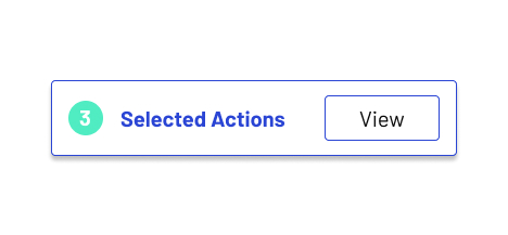
Fig. 2. Selected Actions function
︎Unable to identify purpose of iconography
All users were not able to identify the infographic iconography/legend (Fig. 3.) because they were not aware of its use or function. Some users claimed that they were unsure of what it was, but determined that it pertained to each stage of the process. However, they only realized this after going through the whole journey.
︎ Possible design solutions:
• The colours for each section can be applied to its appropriate stage to increase visibility and enhance recognition. This can be implemented on certain graphics or text elements (changing colour themes for each stage).
• Since this can be considered as a secondary progress status, its presence may not be necessary. Therefore, eliminating this element can reduce clutter and the chance of any errors within user recognition.

Fig. 3. Iconography/legend (which represents sections of the final project plan)
Help save the planet by starting within your own community: Improvements and final web/mobile designs
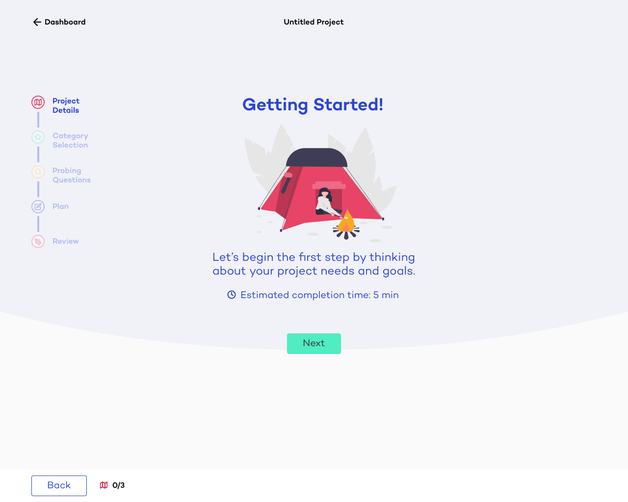
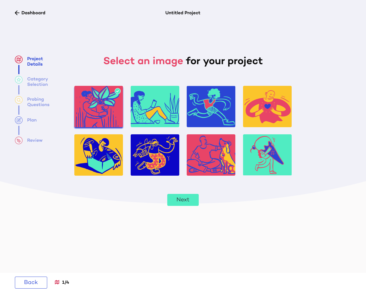
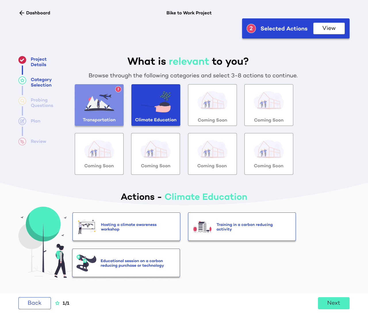
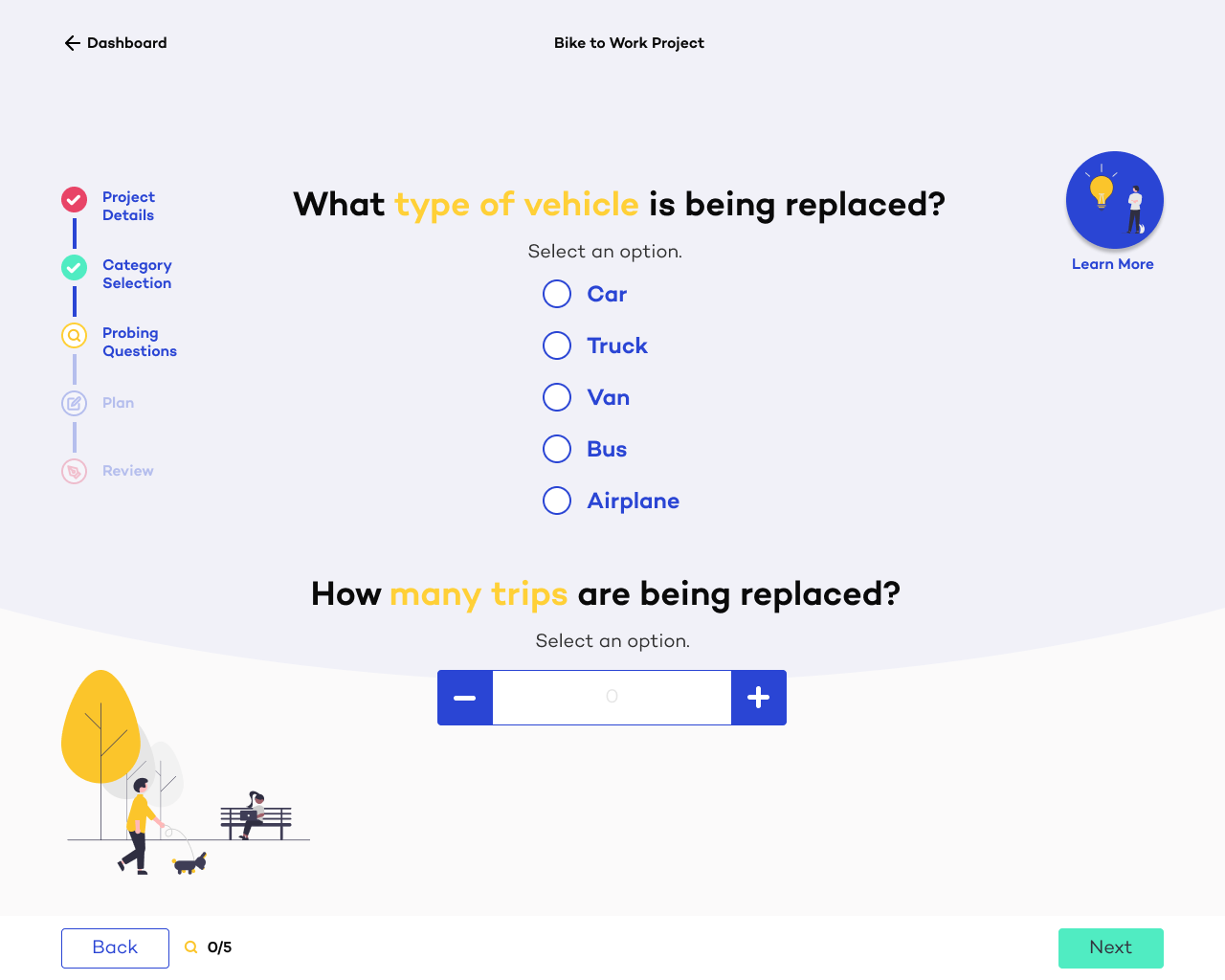
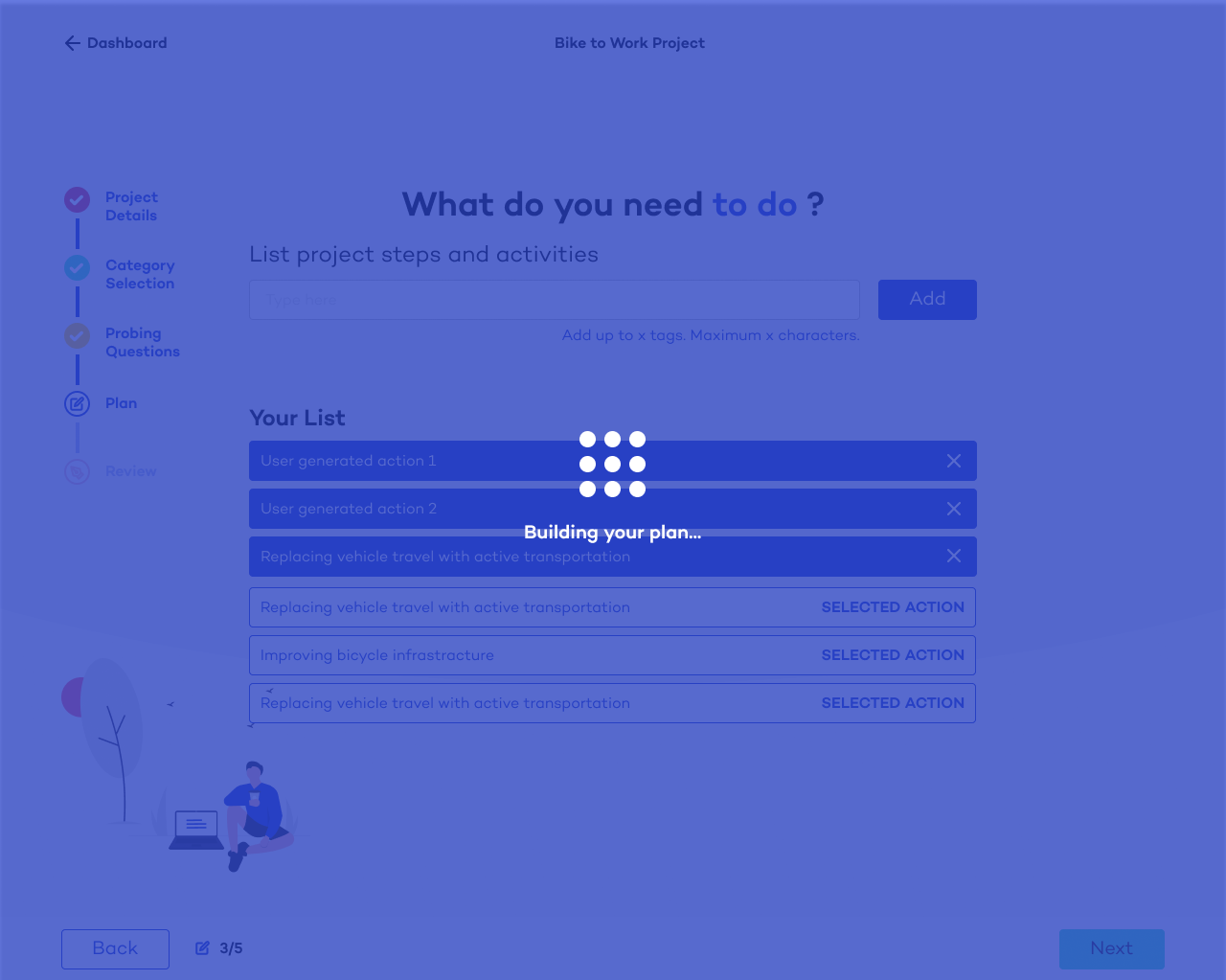

Final Web Mockups

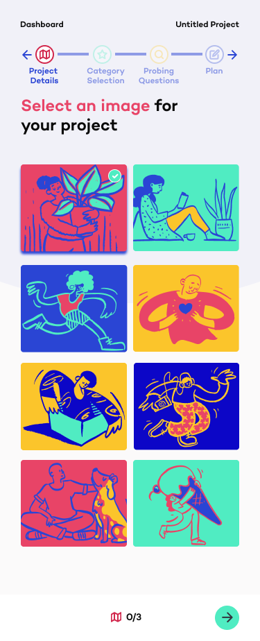
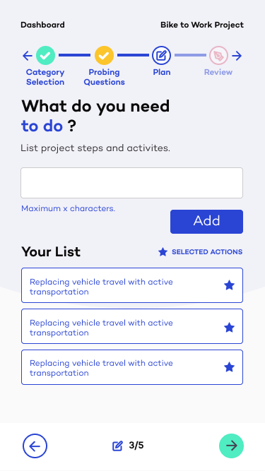

Final Mobile Mockups
Next Steps
Our team would like to complete more testing with users to further enhance the user experience, and be open to any improvements to the product that meets both the user and client needs. We will also look at future UI and UX enhancements throughout the rest of the product, including our biggest feature — Selecting “Actions”.
︎ Project Neutral’s Low Carbon Communities is currently under development. I have gained permission to showcase the presented assets and progress of the project at this stage.
