Voila Learning︎ is a virtual immersion campus that offers immersive learning, delivers online programs and provides online professional development. It is a platform that allows students, institutions, and organizations to engage, improve, and expand their ability.
My Role
Information architecture
UX/UI design
Research, prototyping
Contribute to the design & research of the virtual campus’ layout plan
Information architecture
UX/UI design
Research, prototyping
Contribute to the design & research of the virtual campus’ layout plan
Results
Seemless experience
Intuitive course creator for admins
Clear relationship between the virtual campus & web platform
Maximize connectivity within the virtual campus
Seemless experience
Intuitive course creator for admins
Clear relationship between the virtual campus & web platform
Maximize connectivity within the virtual campus

One of the biggest barriers to online learning is loneliness
Too often, students are alone with their computer watching a pre-recorded video from a professor whom they never met or interacted with. Voila aims to help universities and educational institutions build a community of learners through live interactions among students, teachers, and moderators.
This part of the project primarily focuses on the web-based platform, which is utilized by students to access content and for admins to upload content.

Ideation: Early sketching of admin & student screens
Increasing productivity in a gaming environment
The first major UX challenge is to determine how to keep the user updated with everything that’s happening within the campus while learning. This also puts a focus on the ‘immersive learning’ aspect of the product since we want it to avoid being static like most learning platforms are.
The second major UX challenge is creating a simple, intuitive ‘course creator’ for admins, as most of these users come from various backgrounds in their use of technology. It would have to be applicable and functional to the general mass. Thus, its ease of use is a crucial part of functionality

System mapping; relation of the learning web platform within the campus (early stages)
We needed to understand our users and the service we provide. This allowed us to see the relationship between two entities (virtual campus & web platform) and visualize how we can merge them to create a seamless experience.


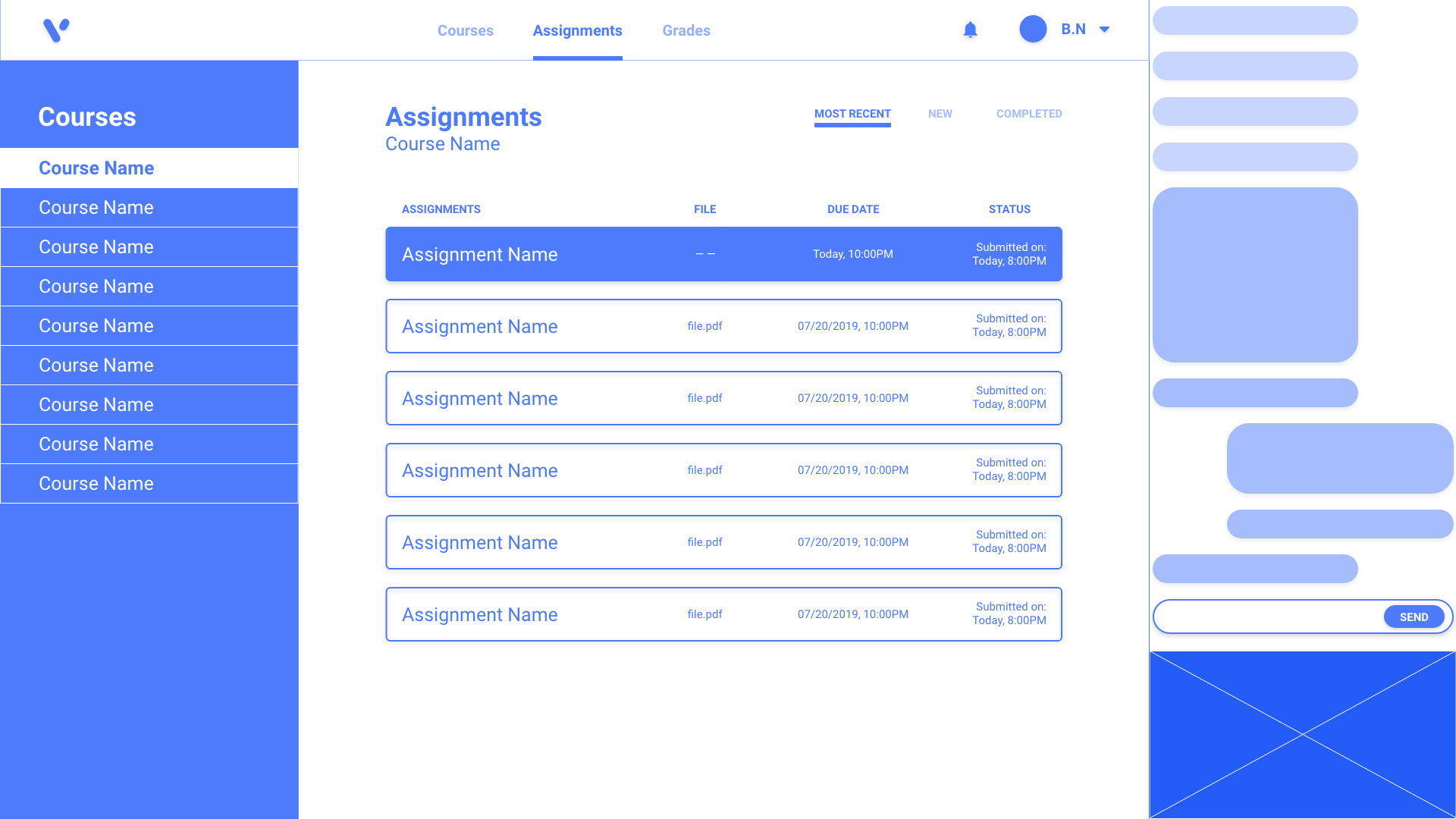
Wireframes: Admin web pages


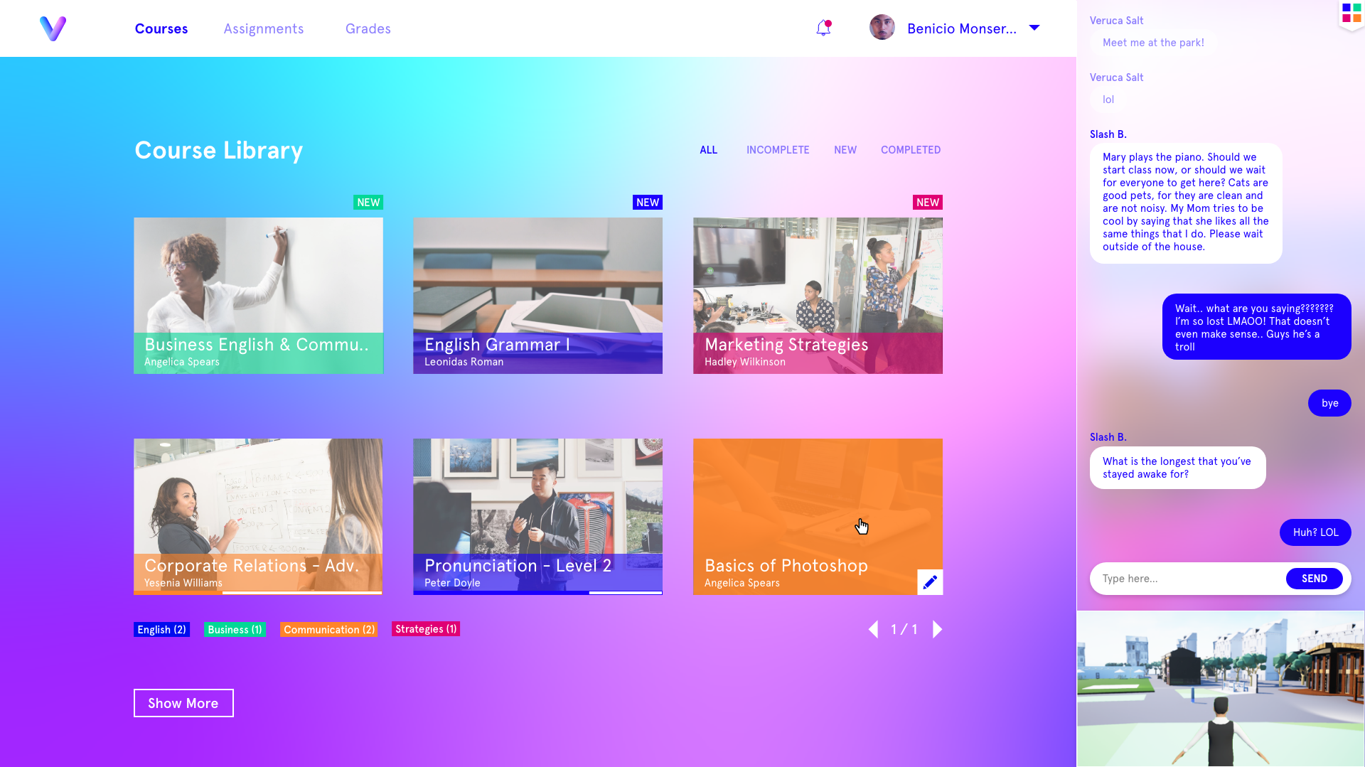
Wireframes: Student web pages
A functional course creator; for all
We chose a minimal and bold design to create a simple, intuitive interface for the admin’s web portal. We believe this to be a wise decision as we didn’t want to overload the user with information, yet staying true to the brand guidelines. Using colours that correspond to course categories builds familiarity.
A ‘step by step’ method of filling in the required fields when building a course also decreases the complexity of the user’s journey. All this, accompanied by a simple UI design completes our goal of increasing the ease of usability for users.


Final admin web pages
Customized learning experience
To solve our first major challenge, we created a designated area for updates on the right side of the screen. This area contains a live global chat and a live scene of the campus on the bottom left, which users can click to return to the campus.
They can also click the designated icon within the campus to return to the learning screen as they wish.

Live chat + campus preview feature


Final student web pages
︎
Part 2: Virtual Campus Layout Plan
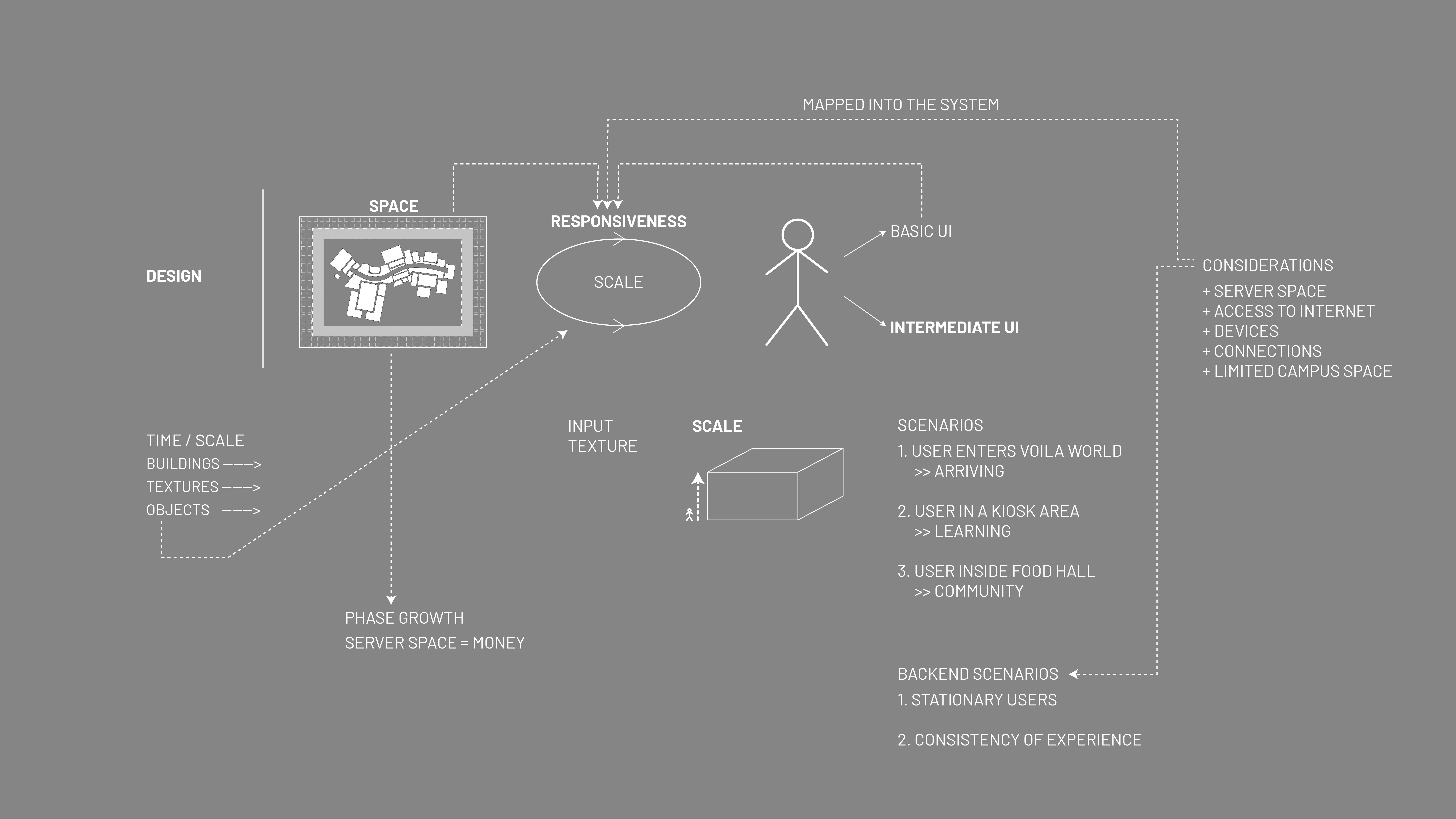
This part of the project focusses on the campus city plan of the platform and how it’s mapped into the system. We took the limitations we had into consideration and how it’s responsive with the scale and the user.

Ideation: early campus layout design

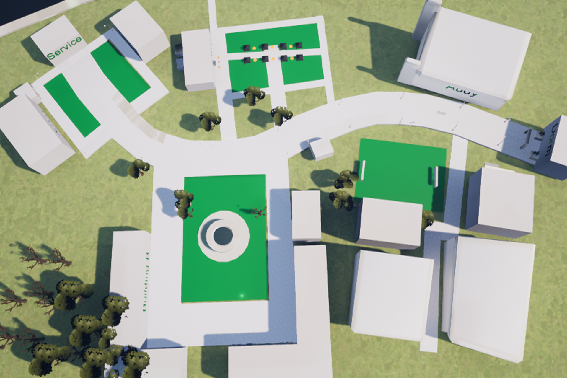
Early campus design; visualizing layout
Maximizing connectivity
Maximizing connectivity was one of the biggest tasks we had, as we wanted users to be engaged and inclined to explore the campus. Determining the applicable layout of services and buildings was key to tackle this challenge.
We decided to sort the required services and buildings in different possible layouts (3 Versions: see gallery below). We determined which should be kept based on its relativity to a school campus and the features it provided. This process allowed us to visualize the campus as a whole system, while intentionally maximizing connectivity in each iteration.
We decided to sort the required services and buildings in different possible layouts (3 Versions: see gallery below). We determined which should be kept based on its relativity to a school campus and the features it provided. This process allowed us to visualize the campus as a whole system, while intentionally maximizing connectivity in each iteration.
︎Version 1: Balance of services, transportation & public spaces
︎Version 2: Allocation of buildings & services in a central hub.
︎Version 3: Distributing buildings & services near the metros. The elevated area can serve as an observatory or a lookout.(
︎Version 2: Allocation of buildings & services in a central hub.
︎Version 3: Distributing buildings & services near the metros. The elevated area can serve as an observatory or a lookout.(


Campus layout iterations; sorting of services and buildings (Versions 1-3 [Left to Right])
The virtual campus
We didn’t want to restrict the user due to any possible forced pathways (sidewalks, etc.), because we thought that the most sensible thing to do was to model the plan after a typical university campus. Another challenge was to figure out how to keep the user within the campus, and not wander off; this also relates back to the first challenge of maximizing connectivity.

Campus system, in relation to its space
Determined campus layout plan: Version 1 - Balance is key
The distribution of services and buildings in Version 1 aided users in social interaction (i.e. cafe, game, etc.) around the main school buildings where the most activity occurs. This increases the chances of users staying around that same area as they would be more inclined to visit these services after/before their main task(s) (i.e. attending a lecture).
In comparison to the other versions (2&3), Version 1 displayed a balance of social interaction throughout the whole campus, whereas the other layouts highlighted “hubs” or particular areas of connectivity.
In comparison to the other versions (2&3), Version 1 displayed a balance of social interaction throughout the whole campus, whereas the other layouts highlighted “hubs” or particular areas of connectivity.
Like most school campuses, it contains roads and sidewalks to guide people from one place to another. However, applying the same idea to a digital campus isn’t ideal because it forces the user on a directional path and also encloses an area. To make this campus feel larger than it is, one of the solutions we came up with was allowing possible pathways from all directions by eliminating sidewalks or pathways around the buildings, giving the user the main decision on where and how they want to get from A to B.


Layout inspirations
City skyline facade
We decided to have one major road to give the user a sense of direction but to also show a linear pathway, which would aid in visual sensibility - where to direct new users. To keep the users within the campus and avoid them from straying away, we designed a city skyline facade that enclosed the whole campus. The facade gave the effect of something that is endless, but too far to reach. This also helped in making the campus feel bigger than it really is.

Sketching: City skyline facade

︎ Due to recent partnerships, Voila Learning’s virtual immersion campus is now under a different name: “LiVe Virtual Campus”; as of 2020.
